
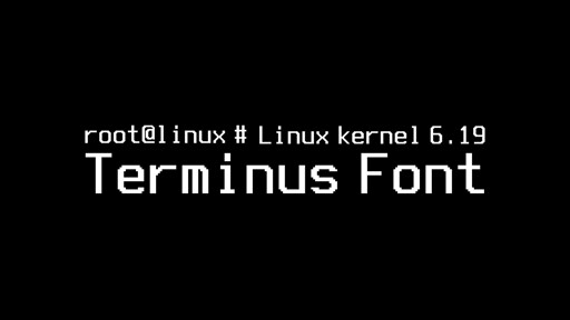
Beyond technical improvements, Linux Kernel 6.19 will also deliver something that, oddly enough, can be seen from a more aesthetic point of view. And more specifically, it is set to introduce a new Terminus 10×18 console bitmap font, offering a clearer, more balanced option for users who rely on text-mode consoles.
The addition arrives through a recent PR as part of a broader set of fbdev updates targeting the 6.19-rc1 cycle. Expectations are that the new font will improve readability in environments where console clarity still matters, especially on modern laptops and framebuffer-based systems.
The Terminus 10×18 font is designed specifically for mid-density 13–16-inch laptop displays with resolutions such as 1280×800 and 1440×900. Existing built-in fonts, most notably the long-standing 8×16 fallback used by the kernel for decades, tend to appear cramped or thin on these panels.
You got a better idea for text mode?
Yes, the kernel doing hardware things and another part doing rendering for example, interacting with the kernel.
Text mode isnt just the kernel… the first thing that starts after the kernel is the init system.
It’s a shame you’re getting downvoted since you’re actually right, and distros are in the process of moving to “kmscon”, a userspace console, rather than the old kernel console (Which iirc isn’t actually intended to be a general purpose console, it’s meant for boot messages)
That said, the fonts the kernel uses are old style bitmap fonts, extremely limited “attack surface” as they’re not doing stuff like opentype/font shaping, it’s just setting pixel values directly.
He wants pixels instead of fonts I guess. Not the sharpest drawer in the toolbox.