

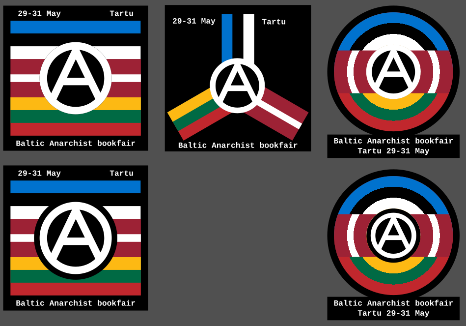
So I recently discovered there’s an anarchist bookfair happening in Tartu, Estonia. So I made these icons as a way to contribute spreading the news. What do you think?
More info about the bookfair is here: https://riga-anarchist-bookfair.hotglue.me/
So I recently discovered there’s an anarchist bookfair happening in Tartu, Estonia. So I made these icons as a way to contribute spreading the news. What do you think?
More info about the bookfair is here: https://riga-anarchist-bookfair.hotglue.me/
I think this is always a problem when trying to make widely understandable visuals. Because everyone knows how to make quickly understandable visuals they become overused. When trying to make something unique you end up with something that’s confusing or overly complex. The ACABB poster is a prime example of something that tries to be unique but ends up so noisy that you can’t really understand what’s going on: https://acabb.noblogs.org/files/2025/08/acabb-poster-v1.pdf especially if it’s in black and white.
I could use the borders but that feels conflicting the anarchist “no borders” ethos. The only reason I used flags is to signify the cultures and peoples of the region, not the states. Although I guess you won’t really think about that.
The problem is that I need a visual indicator for the Baltic region that isn’t based on the states, but rather the people.