

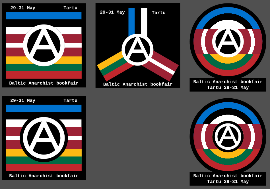
So I recently discovered there’s an anarchist bookfair happening in Tartu, Estonia. So I made these icons as a way to contribute spreading the news. What do you think?
More info about the bookfair is here: https://riga-anarchist-bookfair.hotglue.me/
So I recently discovered there’s an anarchist bookfair happening in Tartu, Estonia. So I made these icons as a way to contribute spreading the news. What do you think?
More info about the bookfair is here: https://riga-anarchist-bookfair.hotglue.me/
I’m loving the bottom left. The black border around the circle-A gives it a sense of prominence that is lost on the version above it.
I find the right side is getting a bit too messy in terms of readability, and don’t read as flags. The middle is okay, but I think it would only look good on a transparent background and probably wouldn’t scale down very well.