

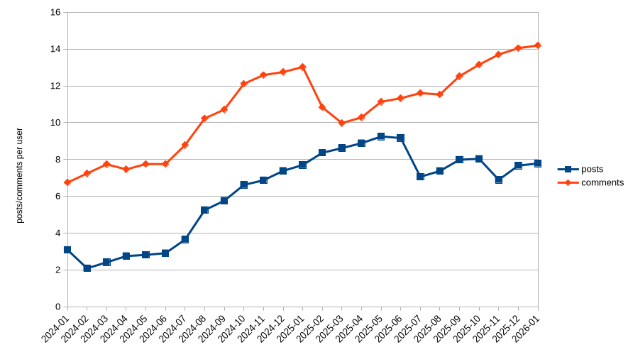
Following https://tarte.nuage-libre.fr/c/fediverse/p/194717/we-need-more-users I decided to explore data a little bit more. I’m not the biggest fan of growth-as-as-target so I wanted to see how much the people were participating in the discussion.
The data
I took the data from the API explorer in https://api.fediverse.observer/ with this query:
query {
  monthlystats {
    date_checked
    softwarename
    total_posts
    total_users
    total_comments
  }
}
Then parsed the json with this https://jqlang.org/ filter:
jq '.data.monthlystats | map(select(.total_users > 0 and (.softwarename == "lemmy" or .softwarename == "mbin" or .softwarename == "kbin" or .softwarename == "piefed"))) | group_by(.date_checked) | map( {date_checked: .[0].date_checked, total_users: ([.[] | .total_users] | add), total_posts: ([.[] | .total_posts] | add), total_comments: ([.[] | .total_comments] | add)}) | map({date_checked, posts: .total_posts/.total_users, comments: .total_comments/.total_users}) | sort_by(.date_checked) | map([.date_checked, (.posts | tostring), (.comments | tostring)]) | .[] | @csv'
(As you see I filtered for the threadiverse. I also did the same with all software, I’ll put the graph for that in comments)
Then did a good old’ chart
What to think of it
I don’t know. Users’ activity is on the rise and I find it nice
I just went to “All” and sorted by “Top: Today”.
90% is memes.
I did that and it was evenly split between news, memes, reposted Tumblr and X posts and comics.
I guess I considered the Tumblr and Twitter posts as memes since they are just screenshots.
Ok, what content stream in what medium when viewed in a bulk popularity view like that isn’t 90% memes or equivalent?