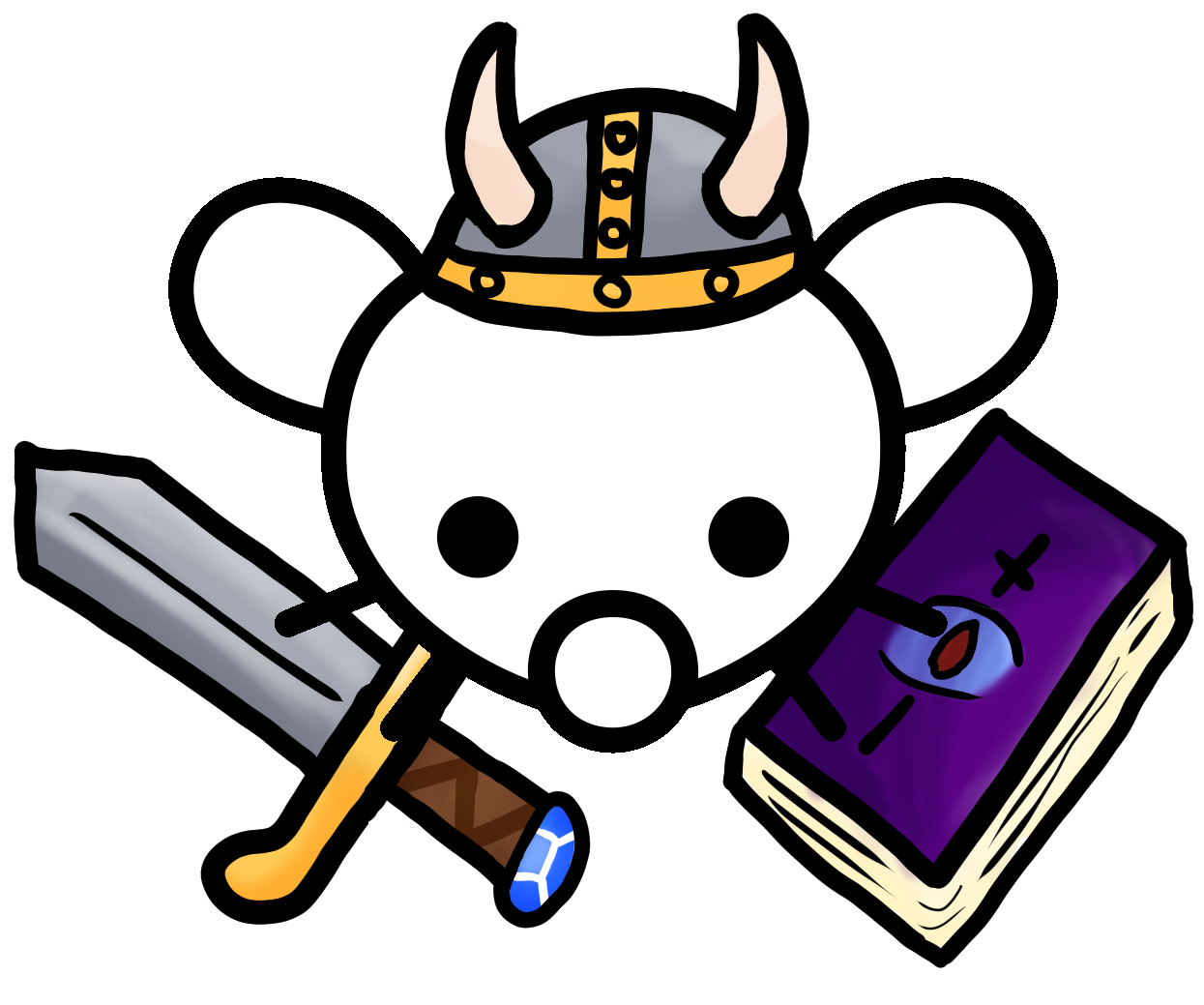
I mod/curate [email protected] and we have a solid icon:

I tried to replicate the style for [email protected]:

But IMO it didn’t work out that well, the styling of the 3 elements (helm, sword, spell book) doesn’t align with the Lemmy mascot style. The tycoon icon is “hand-drawn” and the cRPG icon is the best I could find on google images.
It’s somewhat fine as people see it at a lower resolution, but my OCD doesn’t let me let go.
If someone has time/interest to build out a more coherent version where the 3 elements (helm, sword, spell book) align with the Lemmy mouse flat/comic style, I would appreciate it. If not, that’s fine too.


Im not the best at art, but I took a shot at drawing one anyway x3… mostly for my own entertainment
Thank you!
Now I got to choose between two good variants!
You’re making my life difficult!😆
You’re making my life difficult!
Ah yes, my specialty UwU
do you have the sources for the three items? I could then try to make it a coherent icon.
Sure, PNG variant of helm, sword, spell book:
https://images2.imgbox.com/e0/85/sDbsc6nY_o.png
https://images2.imgbox.com/02/7f/tpnKGFwB_o.png
https://images2.imgbox.com/90/85/V5ltIFR6_o.png
Base Lemmy mouse:
https://images2.imgbox.com/2d/7d/8scPNX4x_o.png
Cheers!
how about this? flat coloured with approximated same stroke and border widths?

(i have it as svg available)
Thank you so much!
Final version is now on [email protected]
EDIT: My sincere apologies, but I think second variant (lower in the thread) is a better fit.
no prob, t’was fun :)
What about erpg?
You’re welcome to post your icon variant for an erpg style.
Keep in mind no one said it’s going to be uploaded. 😆


