On one hand, its not that bad on a Mac… but that’s because the OS is designed in such a way where there’s nothing there and it sorta gets lost. Windows isn’t like that at all.
On the other hand, At least its not right above the keyboard like some of the ones we have at work… the “up the nose” cam is not flattering.
I hate the notch, and I used to say I’d rather have a bezel, but after going back to one of my pre-notch laptops, not having a bezel is nice. I still hate the notch though. I wish I could opt for just not having a built in webcam. It’s not like they use it for faceid, and I use an external webcam for work meetings anyway. Plus the iPhone seamlessly works as a webcam.
I realize my tone could be misinterpreted, my intention was to support your comment on the new model and how it can look like a step backward compared to previous models.
but that’s because the OS is designed in such a way where there’s nothing there
This is not true. There are multiple third party apps that help you avoid having menu icons disappear behind the notch. I don’t use those though, and instead blindly drag my menu icons behind the notch repeatedly until the one I want pops out from behind it.
but that’s because the OS is designed in such a way where there’s nothing there
Ehh OSX uses the top of the screen as a menu bar so for apps which have a lot of menu bar options, those are gone. A lot of third party apps also let you place helpful widgets on the menu bar so that’s kinda not a thing anymore either.
You don’t use macOS do you? Any apps that have that many items on the menu bar are simply pushed to the right of the notch. There is 2” of blank menu bar in 99% of all use cases.
And if you still don’t like it, you bump the uninterrupted menu bar under the notch fully and everything above it (to the left and right of the notch) black as if there’s a bezel.
If the app menu spills over to the other side of the notch it hides all your utility icons with no good way to access them. Even Windows XP handled that situation better, I don’t understand why MacOS still sucks at it.


On one hand, its not that bad on a Mac… but that’s because the OS is designed in such a way where there’s nothing there and it sorta gets lost. Windows isn’t like that at all.
On the other hand, At least its not right above the keyboard like some of the ones we have at work… the “up the nose” cam is not flattering.
Just give me a bezel, I want a machine not a fashion accessory.
I hate the notch, and I used to say I’d rather have a bezel, but after going back to one of my pre-notch laptops, not having a bezel is nice. I still hate the notch though. I wish I could opt for just not having a built in webcam. It’s not like they use it for faceid, and I use an external webcam for work meetings anyway. Plus the iPhone seamlessly works as a webcam.
The pessimist sees the notch as wasted space, the optimist sees it as extra screen.
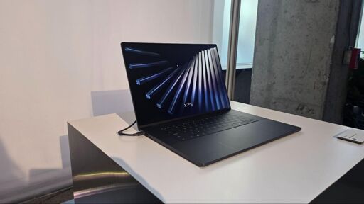
For xps price, they need to stick it under the screen. I hard pass on needless bezel and always on notch.
They literally had the small bezel and the camers on top in a previous XPS model.
Yeah, but no notch, so the bezel wasn’t excessive or needless. I still passed on it, though. But that’s a personal choice.
I realize my tone could be misinterpreted, my intention was to support your comment on the new model and how it can look like a step backward compared to previous models.
My intention was not to refute your comment. :)
This is not true. There are multiple third party apps that help you avoid having menu icons disappear behind the notch. I don’t use those though, and instead blindly drag my menu icons behind the notch repeatedly until the one I want pops out from behind it.
Yikes, just apple things I guess
Ehh OSX uses the top of the screen as a menu bar so for apps which have a lot of menu bar options, those are gone. A lot of third party apps also let you place helpful widgets on the menu bar so that’s kinda not a thing anymore either.
You don’t use macOS do you? Any apps that have that many items on the menu bar are simply pushed to the right of the notch. There is 2” of blank menu bar in 99% of all use cases.
And if you still don’t like it, you bump the uninterrupted menu bar under the notch fully and everything above it (to the left and right of the notch) black as if there’s a bezel.
If the app menu spills over to the other side of the notch it hides all your utility icons with no good way to access them. Even Windows XP handled that situation better, I don’t understand why MacOS still sucks at it.