One quickly learns that drawings don’t have to be detailed or experienced to be appreciated. Sure, it absolutely helps, learn what techniques make art more beautiful so you can punch above your weight, but I’ve received compliments from quick minimal doodles just by having fun with it.
In the song, Badger is a monotone repetition, hence being the X axis. When Mushroom comes in, it pitches up, hence being the Y axis. Then, when Snake comes in it fluctuates in pitch with an overall rise.
The humor is clever enough on its own, but the roughly sketched chart with clipart sells the fact that the joke is in the delivery and being sent quickly without being overly refined to the point that it looks polished. The rough rounding of the background makes it even more funny for me, because it was like an attempt was made.
Peak artistic humor by looking like an idea was thrown together to get the joke out as fast as possible. Maybe it was quick, maybe it took time to do for the end result, but the look comes through.
“Uh, should I label the axes «good» and «gooder»? «Good» and «better»? Nah. Oh look the line I drew looks like a snake. Snaaake, snaaaake… wait, there’s a song like this, right? Ah, the badger song! This works: badger, mushroom, snake. Done.”

I’ve got people praising my poorly drawn graphs, of all things. 5min stuff like this:
So yes, odds are they’ll like your drawings better over mass produced AI slop.
One quickly learns that drawings don’t have to be detailed or experienced to be appreciated. Sure, it absolutely helps, learn what techniques make art more beautiful so you can punch above your weight, but I’ve received compliments from quick minimal doodles just by having fun with it.
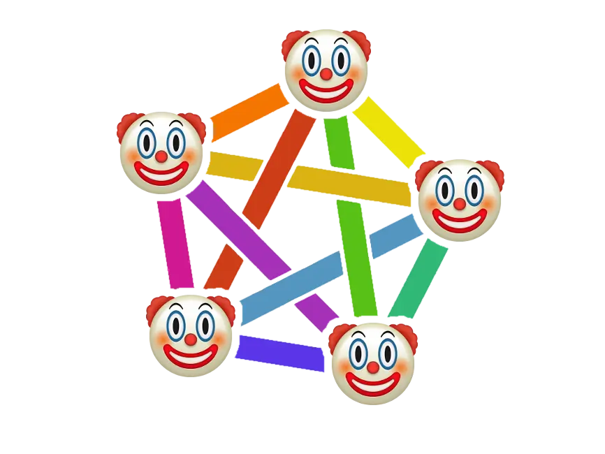
you’ve inspired me to make my own pie chart about a parody for badgers lol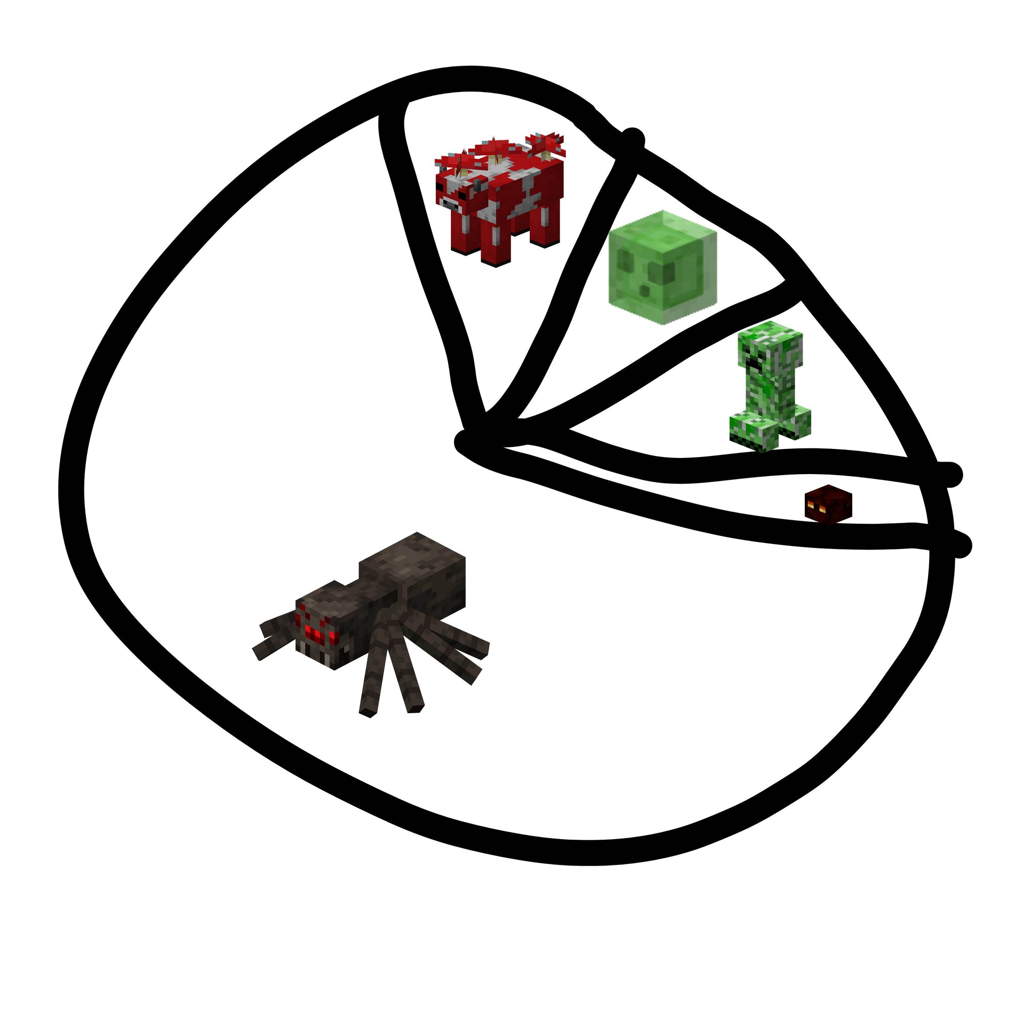
Except that honey badger don’t care 🦡
I understood this and now my back hurts!
Oh!? Its a snake?
Mind to eli5? Or link a video?.
I feel like this references an old meme… But I can’t remember what it is.
Edit: badger badger badger badger https://youtu.be/NL6CDFn2i3I
How I read the image:
In the song, Badger is a monotone repetition, hence being the X axis. When Mushroom comes in, it pitches up, hence being the Y axis. Then, when Snake comes in it fluctuates in pitch with an overall rise.
The humor is clever enough on its own, but the roughly sketched chart with clipart sells the fact that the joke is in the delivery and being sent quickly without being overly refined to the point that it looks polished. The rough rounding of the background makes it even more funny for me, because it was like an attempt was made.
Peak artistic humor by looking like an idea was thrown together to get the joke out as fast as possible. Maybe it was quick, maybe it took time to do for the end result, but the look comes through.
Perfection
In the meantime, artist intention be like:
“Uh, should I label the axes «good» and «gooder»? «Good» and «better»? Nah. Oh look the line I drew looks like a snake. Snaaake, snaaaake… wait, there’s a song like this, right? Ah, the badger song! This works: badger, mushroom, snake. Done.”
(Glad you liked my 5min example!)
I love this!