

You must log in or register to comment.
It certainly covers all the bases.
I know, right? It’s perfect.
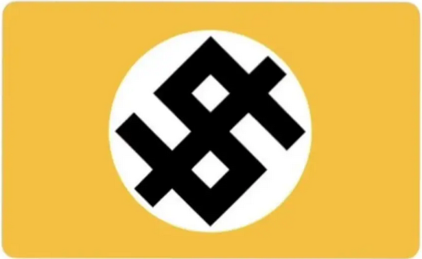
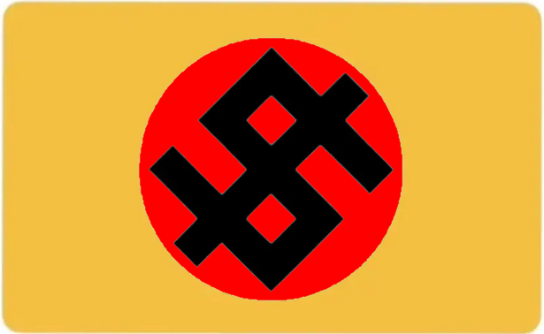
Money, a Swastica and a Cross. beautiful.
Also an U, an S and an A
deleted by creator
What’s an amogus?
ඞ
Also a 5 and an I or l
And +,-,±,×,÷,>,<,=,≠ and all 8 trigrams of the I Ching
Good spot
Swastikas technically already include the kind of cross the Romans would have actually used
I also see an Odal Rune very appropriate and quite popular with the far right.
The SS used a slightly different version, but I’ve seen this one more frequently.
I am saving it to my political images folder. This design is a perfect encapsulation of the shittier aspects of society.
What other stuff you got in there?
Here ya go.
Looks blurry compared to OPs image which appears to be vector graphics. Just saying. Image compression perhaps?
deleted by creator
Thanks!
I love this, so I took a moment and recreated it as a vector image. Here it is if anyone wants it for printing or whatever. I squared the edges so it’s more versatile, too. (Sorry for the google links, I know it’s ironic and not ideal. The preview looks weird, but the file will download fine.)
Nice!
Question for graphic designers:
I get why red would be too obvious, but why is yellow significant.
Gold/Black == Ancap (derogatory)
is gold*
I just modified it, and it has become even more on the nose. 🤮
There’s something kind of clever about heraldic implications of the original (intentional or not) that this misses.
Supposedly, the first rule of heraldry is " the rule of tincture: metal should not be placed upon metal, nor color upon color". White represents sliver and yellow represents gold, so they should not touch (metal upon metal). There are many exceptions in heraldry, but the rule still kicks around. Vatican City’s flag explicitly breaks this rule to demonstrate that “Vatican follows God’s rules and not man’s.”
I find it clever that a flag of capitalism would have a field of gold and a giant roundel of silver (called a plate when silver, silver plates are also associated with wealth), and they touch to demonstrate that capitalism doesn’t care about the rules.
In heraldry red often stands for courage, and that’s not a virtue I associate with capitalism. Also a red roundel is called a tart, and tarts are delicious.
For me, the red stands for two things: “blood” and “Nazi”. I consider fascism to be the next stage of malignant capitalism.
For some reason being a nerd about heraldry scratches an itch for me. Traditionally the “stain” Sanguine represents blood.
Red is the most common color in national flags. I wouldn’t want to cede the color to Nazis.
Fascism isn’t a stage of capitalism necessarily. It’s more of a tool that capitalists bring out whenever labor threatens to take back what’s ours. It’s always there, loitering in the background, silently threatening us to stay in line.
Nice. I was thinking it might look best with both green and gold. It would be symbolic, to symbolize… green and gold.
[edit] on further thinking silver & gold would also be good. it would symbolize -you know.
Remember the No step on snek posters ?
99.9% of graphic designers wouldn’t have a clue why.
Ketchup and mustard
I do like the idea of capitalisms colour being yellow.
This is far too orange to be appropriate however.
It’s gold-like, which seems congruent to me. Yellow by itself doesn’t say too much about capitalism, maybe anarcho-capitalism, but not capitalism as a whole.
That’s where my mind was at but didn’t want to directly reference actual propaganda. anarchy and capitalism are mutually exclusive.
@[email protected] got the right idea. yellow = cowardice.
What I think is that the symbol has to be credible, it has to make you think “Yes, this could definitely be the symbol of capitalism if they didn’t feel the slightest hint of shame”.
That’s why I think this is perfect as it is. I see it clearly being posted on 4chan by an anon presenting it as a symbol of the capital of kekistan or some shit like that.
I think a credible concept would be far more Roman fascism than lol Nazis, it does feel like a 4chan meme it that regard.
Yellow is also in some contexts the color of cowardice, which seems appropriate
Also piss.
Positive research papers on trickle down economics are always printed on yellow paper for this very reason.
It’s funny you mention piss. I think yellow-meaning-coward comes from yellowbelly, an insult from the US Revolutionary War, probably started earlier with Napoleonic war. If a soldier made it through a stand and fire volleys style battle with a relatively clean uniform, they were often seen as honorable and brave. The soldiers covered in battlefield muck (plenty of it human and horse piss) had cowered down in the face of enemy fire, giving them a “yellow” belly.
The orange version actually matches pretty nicely with the world’s current political dumpsterfire.
Libertarians do often wear gold colored ties to visually indicate their political leanings.
“Gold” (that orange-y yellow), as well as regular yellow, is historically the color associated with liberalism (as in capitalism).
Agreed. Orange is more of a fascism kind of color.
Why yellow over red or green?
Red is already taken, and green implies environmentalism.
Cause it’s piss
It’s the favorite color of ancaps
And, missing the bed of shit it sits on — like a throne & birthplace in one.
I think it should be purple. Historically, that was the color of the royalty and the wealthy
True, but Feudalism hasn’t been a powerhouse of global politics as of late.
c/designporn
For those who didn’t notice, there’s a swastika hidden in the
‘hidden’
It’s almost as subtle as fascism hidden in capitalism.
Capitalists hide behind liberalism and fascism - not the other way around.
That’s an odd way to spell “send them to war”, but it checks out.
talking to the empty set are we?
It might have been obvious to you but it took me a minute to notice.
did you not notice that the entire flag is just an edit of the nazi flag?
Yeah, took me a hot minute.
- eyes widen *
And a cross…
Is this the new official flag of the USA?
No, just the flag of the Gulf of America.
I haven’t been this thrilled about a design since Tui’s logo.
fair, tui is pretti gud too <3

“Heil the Oligarchs”
Instead of yellow, black, and white it should be red, black, and white. This way, everyone can see where capitalism is heading to.
the yellow-orange colour represents gold, an obsession with material goods. I think it makes sense personally.
Also, most fast food colors are yellow and orange to make you hungry, so yeah it works from multiple angles
It’s also the color associated with liberalism (as in capitalism).
Everyone wants to add something to it.
“Okay it’s nice, but does it cover all representation equally?”
They’re just excited fans, let them have their fun :P
its already pretty obvious from the logo i feel… no need to over-epmhasize it…
That dude is spot on!
I think it would look better if it was Dollar green.
Gold has a broader meaning.

reactionary capitalism? … makes sense
It looks like intersecting swastikas than a dollar sign. Which is kinda fitting…
I am not sure why the down vote, that is the literal intention of the design.
I didn’t downvote but kinda groaned when I read the above comment.
Explaining a joke (especially when it’s pretty self-explanatory) can be irksome…. especially when explained in a tone like they’re having some revelation about some deep hidden meaning…
Fair
Me neither. When I checked the status of my comment I was wondering why also. I mean it is a dollar sign, yes, but it also very clearly has a swastika in the design.
Which is the entire point of the design, so your comment pointing this out becomes a bit weird.
(I haven’t downvoted you though. I’ll die holding the belief that downvotes should only be seen as an indicator of a malicious or off topic comment, not as a simple ‘disagree’ button)
Well i will attribute it to my autistic mind speaking outloud (then my fingers typing it here).
I really wish swastikas were not used in connection to Nazi stuff, but what’s done is done.
I agree. It is an ancient, ancient symbol in many cultures. I had Hindu neighbors that put swastikas on their door during Hindu festivals and prior to the Nazi rise to power it was just a symbol of good luck in the West.
Also they ruined the toothbrush mustache. Once during the end of a no shave November I decided to see how I would look with that mustache… and I honestly thought it looked good on me.
But I knew I had to shave it off because there was no way I could keep it. Made me hate Hitler more than I already did.
I’m Jewish and I give you full permission to take the mustache back. It’ll help if you wear your “I’m not a Nazi, I’m just taking the mustache back” shirt.


